The real electoral map
November 11th, 2008
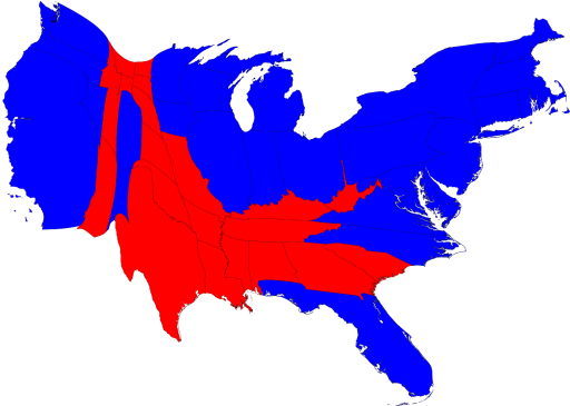
Around election time, there is always a lot of talk about red states and blue states, but as with most things presented by the media, the true picture is less strident than reality. Here is a map from Mark Newman, Paul Dirac Collegiate Professor of Physics at the University of Michigan, showing electoral college results with each state resized according to its share of the electoral college vote.

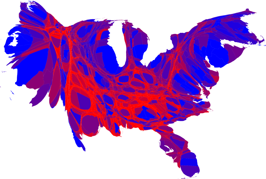
While the map clearly shows that Sen. Obama won the electoral college, it still shows sharp contrasts between red and blue. To get a finer grained, more nuanced picture of the results, Prof. Newman presented the county by county results with the counties shaded blue or red if Obama or McCain, respectively, received over 70% of the vote. More balanced counties are colored in varying shades of purple depending on the way they voted. In this map, the counties are resized according to population.

Clearly, there is a lot of purple and a lot of mixing. Take heart, we aren’t as divided as we are constantly told. You can find more maps and further explanation at Prof. Newman’s election maps site.
Posted in politics | No Comments »
Tagged with: campaign, media, politics
You can follow any responses to this entry through the feed. You can leave a response, or trackback from your own site.

Leave a Reply